Modernizing the Mobile Experience
A redesigned mobile app that gives employees clear visibility into onboarding steps, pending tasks, employee daya, and the things they reach for most.
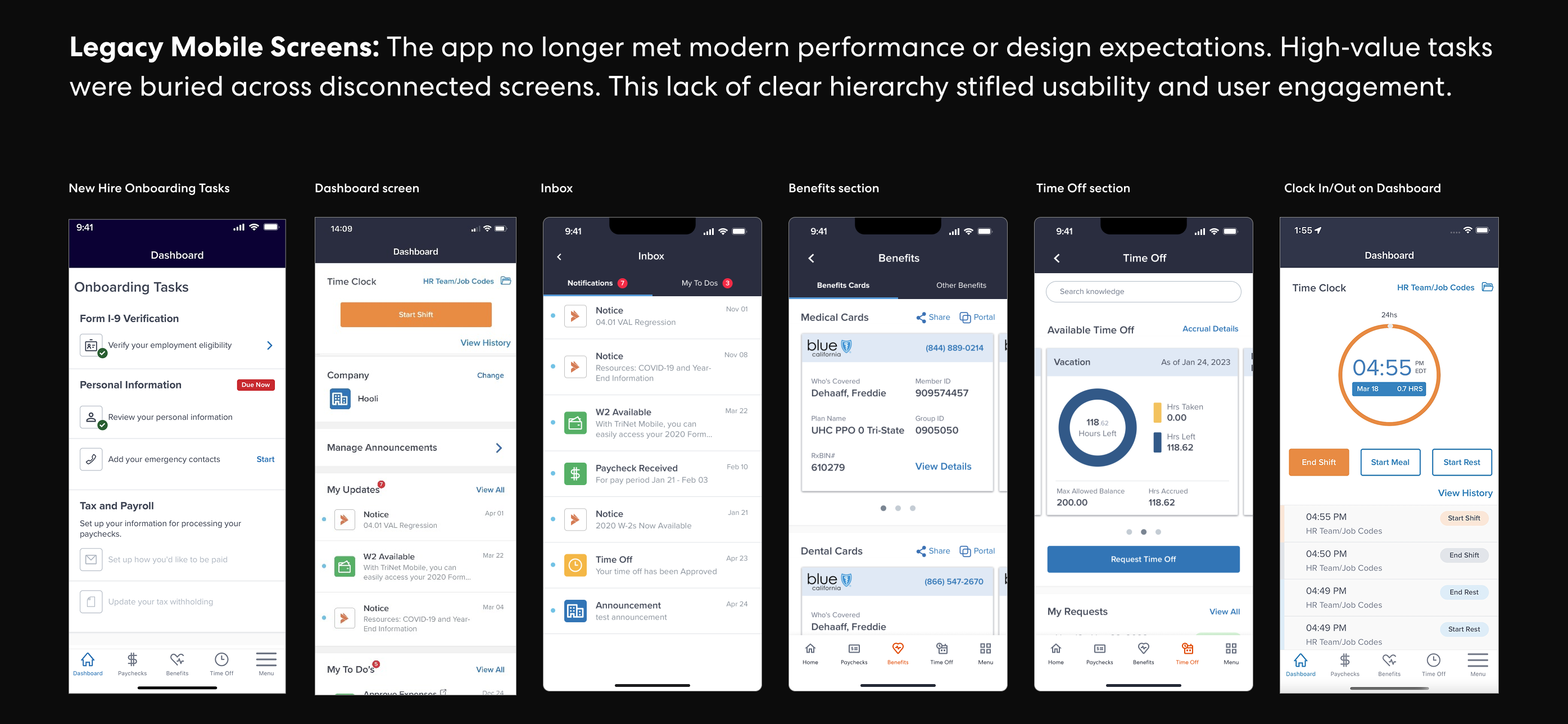
The situation
TriNet's mobile app had fallen behind the expectations employees have for modern workplace tools. Key tasks like checking a paycheck, reviewing benefits, submitting time off, and clocking in and out were buried across disconnected screens with no clear hierarchy or sense of what needed attention. The experience felt dated, and engagement reflected it.
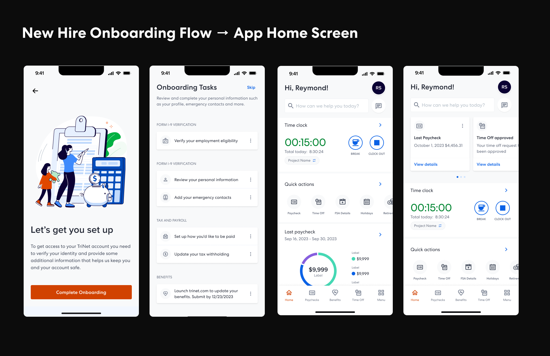
The experience strategy
Rather than reskinning the existing app, I led a ground-up rethinking of the mobile experience around one question: what does an employee actually need when they open this app? The answer shaped a home screen built around tasks, recent activity, and fast access to the features people use most: pay, benefits, time off, and time tracking. Every screen was designed to surface the right information at the right moment, with fewer taps and less guesswork.
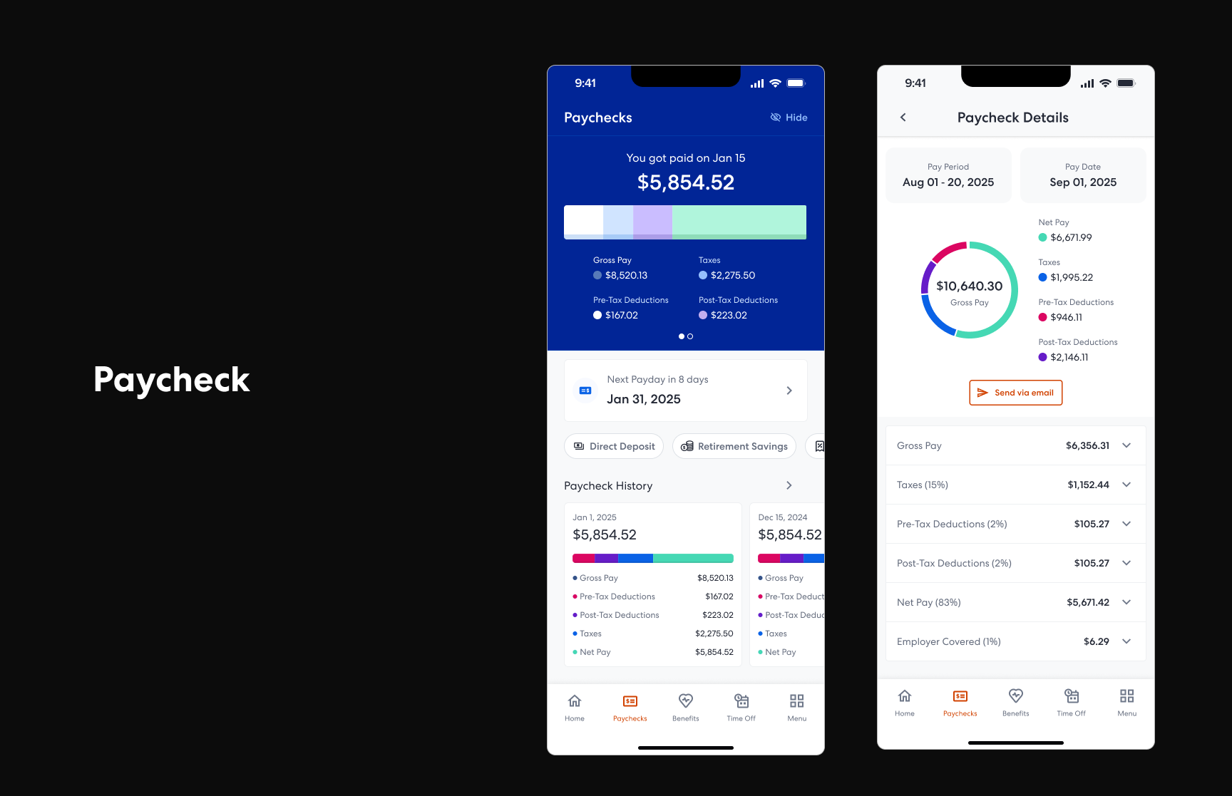
Paycheck at a glance
Viewing pay details was one of the most frequent reasons employees opened the app, but the existing experience required multiple taps and offered little context. The new pay screen puts the latest paycheck front and center with a clear breakdown of earnings, deductions, and net pay, so employees can get the answer they came for without navigating deeper.
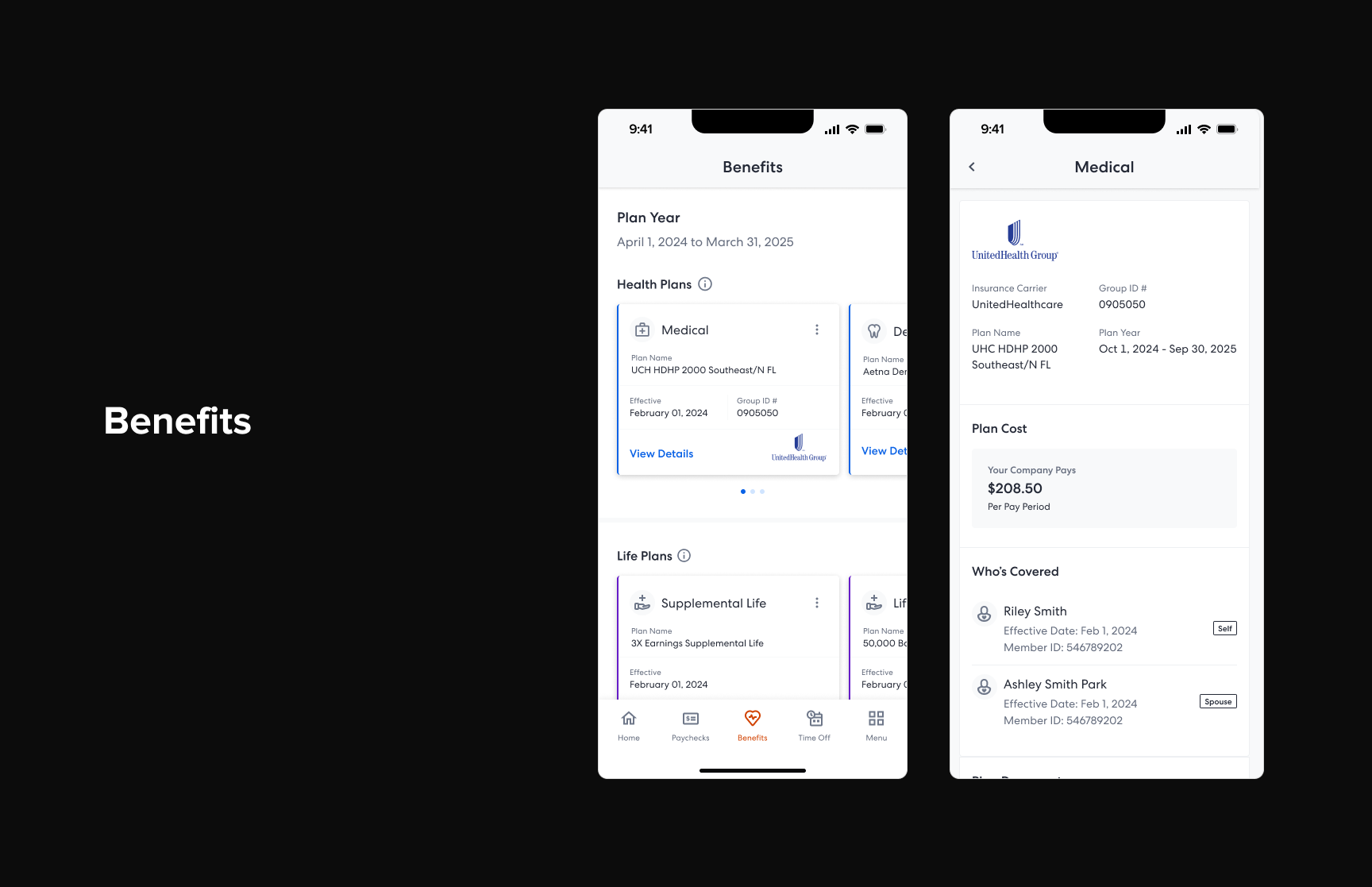
Benefits made accessible
Benefits information is something employees check infrequently but urgently, whether they're visiting a doctor, filling a prescription, or comparing plans during enrollment. The redesigned benefits experience presents plan details, coverage summaries, and ID cards in a way that's scannable and useful in the moment, not just during open enrollment.
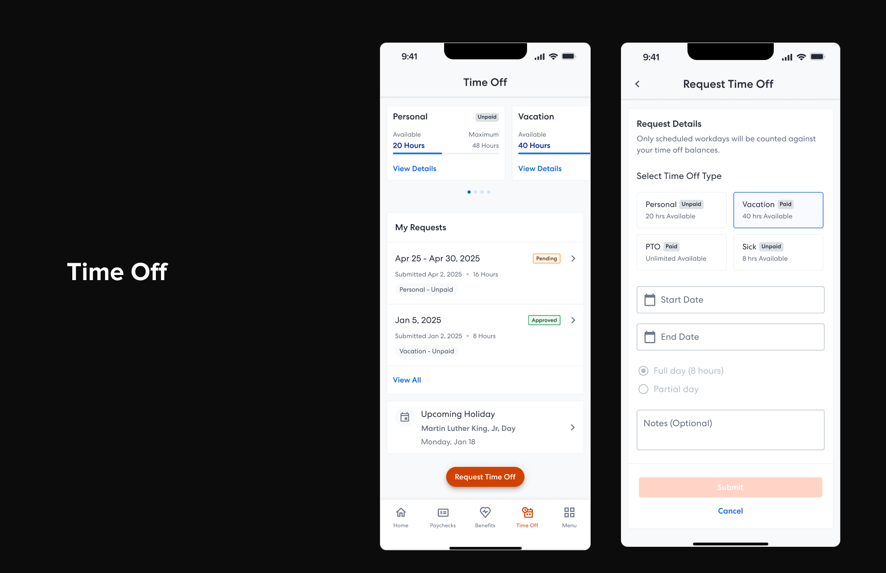
Simpler time off
Requesting time off should feel effortless. The new flow makes balances visible upfront, lets employees pick dates with a clear calendar, and shows request status so there's never ambiguity about what's been submitted, approved, or still pending. The design removes friction from what should be one of the simplest tasks in the app.
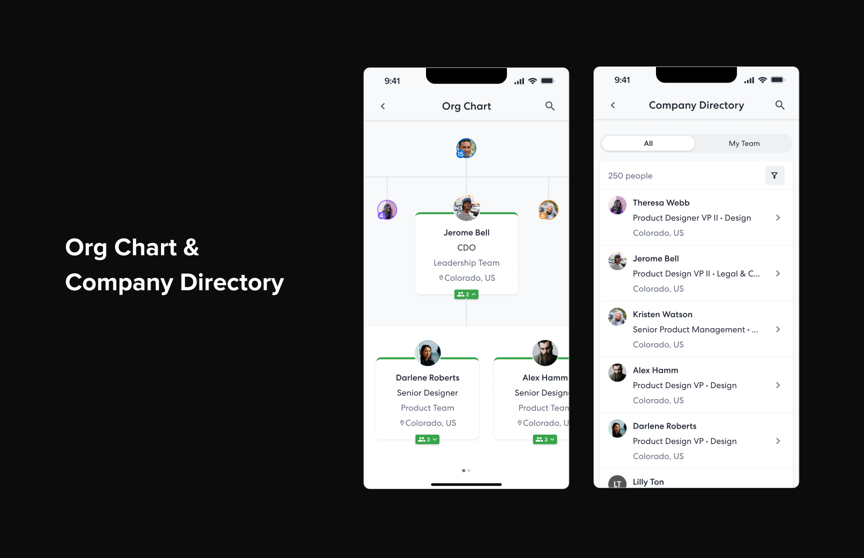
Org chart and company directory
Knowing who's who in an organization matters more than most apps acknowledge. The new org chart and company directory give employees a way to look up colleagues, understand reporting structures, and find contact information without leaving the app. Whether someone needs to reach a manager in another department or just wants to put a face to a name, the experience makes it easy to navigate the people side of work.
What came out of it
The modernized mobile experience gave employees a faster, clearer way to interact with TriNet. Instead of navigating a legacy app to find scattered information, they now have a home screen that orients them instantly and purpose-built flows for the tasks they care about most. The redesign set a new foundation for how TriNet approaches mobile product development going forward.